Tips for Choosing Calm Colors to Create a Relaxing Home
Creating a peaceful and relaxing atmosphere at home often starts with the colors you choose for your walls and decor. Calm colors can transform a space, promoting tranquility and reducing stress. But with so many shades available, it can be tricky to pick the best colors to achieve that soothing vibe. In this post, we’ll explore practical tips for choosing calm colors for your home that will help you create a serene environment tailored to your taste.
Why Choose Calm Colors?
Calm colors are typically soft, muted, and often found in nature. They evoke feelings of relaxation, comfort, and well-being. Using these tones in your home can:
– Reduce anxiety and stress
– Encourage restful sleep
– Foster a welcoming atmosphere
– Make small spaces feel larger and more open
Some popular calm colors include variations of blues, greens, soft grays, and warm neutrals. But choosing the right calm color means considering your personal style, lighting, and the function of each room.
Consider the Room’s Purpose
Different rooms serve different needs, so your choice of calm colors should support the mood you want to create in each space.
Bedrooms
A bedroom should be a sanctuary. Soft blues, gentle greens, or lavender hues can encourage relaxation and help you unwind after a busy day.
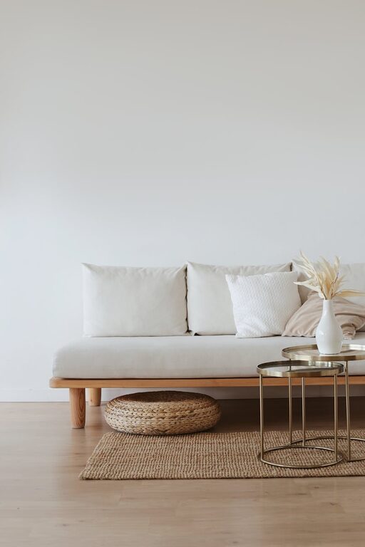
Living Rooms
Since living rooms are for gathering and relaxation, look for warm neutrals like beige, taupe, or soft gray. These colors provide a calm backdrop that works well with various decor styles and can be accented with calming blue or green accessories.
Bathrooms
Light and fresh colors like seafoam green, pale aqua, or soft gray promote a clean and calming ambiance in bathrooms.
Home Offices
For a calm yet focused work environment, think about incorporating muted blues or greens. These colors are known to enhance concentration while keeping the mood relaxed.
Understand Color Psychology Basics
Colors impact our emotions in subtle ways. Here’s a quick guide to how calm colors typically influence feelings:
– Blue: Often associated with serenity and trust, blue tones slow the heart rate and create a peaceful feeling.
– Green: Reminiscent of nature, green is balancing and restful for the eyes.
– Gray: A neutral tone that promotes relaxation without distraction, as long as it isn’t too dark or dull.
– Beige and Warm Neutrals: Cozy, inviting, and grounding, these colors foster comfort without overwhelming senses.
Knowing these effects can help you pick a color that matches the mood you want in each room.
Test Color Samples Before Committing
Paint colors can look very different under natural vs. artificial light, and from morning to evening. Always:
– Buy small sample pots of your favorite shades.
– Paint swatches on walls in different rooms or parts of the room.
– Observe how the color changes throughout the day and how it feels in the space.
– Check how the color interacts with your furniture, flooring, and fabrics.
This step saves time and eliminates surprises after you’ve painted an entire wall or room.
Use Soft Finishes for a Calmer Look
The paint finish also affects the atmosphere. Matte or eggshell finishes tend to absorb light rather than reflect it, resulting in a softer, more calming effect. High-gloss finishes, while durable, can be too shiny and may create visual tension.
Pair Calm Colors with Natural Elements
To enhance calmness, combine your chosen colors with natural materials such as wood, stone, or plants. This connection to nature harmonizes well with muted tones and helps create a cozy, grounded environment.
Balance Calm Colors with Warm or Bright Accents
While calm colors form a restful base, adding thoughtful accents can prevent your space from feeling too dull or monotonous. For example:
– Throw pillows in warm mustard or soft coral
– Artwork with subtle splashes of bright color
– Rugs or curtains with gentle patterns
These touches add personality without disrupting the overall peaceful vibe.
Don’t Forget the Ceiling and Trim
For a cohesive and balanced look, consider painting the ceiling a lighter shade of your main wall color or a crisp white. Trim and moldings painted in soft whites or light grays can frame your walls beautifully while keeping the calm effect intact.
Trust Your Instincts and Personal Preferences
Finally, the most important tip is to choose colors that resonate with you personally. Your home is your sanctuary, and what feels calm and peaceful to one person might feel dull or cold to another. Spend time exploring color palettes and don’t hesitate to experiment until you find what truly soothes your senses.
—
Choosing calm colors for your home is a rewarding process that can enhance your daily living experience. By considering the room’s purpose, testing samples, and blending with natural elements, you can create an inviting, serene atmosphere that helps you unwind and enjoy your space to the fullest. Happy decorating!